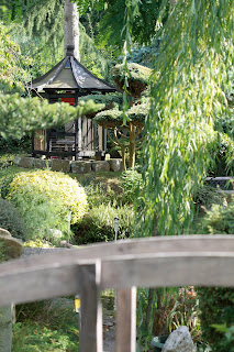
I know, that doesn't sound like something that exists, but sure enough, after a tip off from Clem, Mike and I ventured out with our cameras to Pureland in North Clifton.
It's a little gem of a place, somewhere where i can see myself visiting again in the near future.
Until then, here's some photos of the place, taken with no intention in mind as always.
Monday, 23 August 2010
Wabi-Sabi- The beginning
After a tutorial with the beautiful Clem she set me on the path of discovering WABI SABI.
I ran through all the things i've been looking at, exploring, sketching and planning, which quite honestly is all over the place. But through the connections between japanese wood prints, nature and projection the concept of Wabi-Sabi seems like a nice umbrella heading for this project.
Wabi-sabi is a beauty of things imperfrect, impertinent, and incomplete
It is a beauty of things modest and humble.
It is a beauty of things unconventional.
Clem recommended a book by Leonard Koren, Wabi-Sabi for Artists, Designers, Poets and Philosophers
I am currently reading it, I'll let you know what i think when i'm done.
And the winner is......
My favorite image from the studio session is this one:
The decapitation and loss of the lower part of the body leaves an obscure result of the landscape originally shot.
After seeing the result of this particular projection I made a short video of the static projection but with the subject rotating on the spot. I'm not going to upload it presently, but have faith that it's quite a mesmerizing piece.
Still not sure what all this means, but something has begun.
Reading is now necessary.
Studio Projection Tests
A couple of weeks ago I had a mess around in the studio with a willing subject.
The choice of images projected weren't really planned in advance, I just used whatever I had to hand from my iPhoto library.
It was good to just have a play with textures and poses in preparation for a shoot with a new model scheduled for sometime in the near future.
Some interesting images and ideas came from this session though, here's a few for you to have a look at and respond to if you fancy:
Monday, 2 August 2010
Les archives du coeur
Now this is a box project i like the sound of:
Christian Boltanski - The Heart Archive from O Production Ltd. on Vimeo.
Christian Boltanski: The heart Archive
10 July - 8th August 2010 - Serpentine Gallery
Coalition of the Willing
One of the guests on the panel at the Apple Store was Simon Robson aka Knife Party.
Knife party made "What Barry says" an amazing animation that i've been showing to my students at work for a few years now.
Robson's latest project was introduced to me at the screening and it links greatly to my third project idea.
The project is called "The Coalition of the Willing" - website found here
The narrative and script was written in house, then each scene was sent out to different animators and production houses around the world who then animated the individual sequences. They were then sent back to Knife Party who edited and complied them all together. The end result is a compelling animated short.
May I suggest playing this full screen, I think it's worth it.
Apple Store Screening
Last week the Apple Store Regents street, London hosted a series of screenings in their lecture theatre in association with Rushes.
I wanted to go to all of them but could only afford 1, so I chose "The future of animation"
The panel was made up of 5 creatives working in the industry in some form, be it part of a large company such as Rushes itself, or as freelancers working alone or collaborating with others on independent animation projects.
It was a really interesting session, with the professionals confirming a lot of my own ideas as to where the industry is heading.
Which is nice.
Arcimboldo
I've always loved the work of Arcimboldo ever since studying him at college.
His most famous work for me is his 4 images of the seasons:
Winter
Spring
Summer
Autumn
It was one of my earlier ideas inspired by this work to create my own composite portrait using projections. I did an early sketch during a staff meeting:
The subject is photographed in various poses which are then comped together and projected upon the sitter.
I created a rough mock up using images from a book from the library "Nudes in Motion"
It was an idea that I'd had but forgotten about. Whilst at the Tillmans exhibition last week though I saw his Arcimboldo inspired image and it brought it all back to me.
Wolfgang Tillmans
The other exhibition was "Wolfgang Tillmans" at the Serpentine Gallery.
The first major exhibition of the artists work in London since 2003. Tillmans has redefined photography and the ways in which it is presented. In this exhibition, which he conceived specifically for the Serpentine Gallery, he explores the complexities of photographic image making and exhibition installation. The overall constellation of his pictures, as well as each individual work, reflect his engagement with what he describes as 'an abstraction grounded in the real world'
This is all very well and good, and the exhibition is interesting, but i just didn't get it.
I wandered around the 5 room space and tried to make sense of the varied display of images either framed, in cases, or in some instances simply cello-taped on the walls. Maybe I just wasn't in the right frame of mind, but after a while I just gave up and began just looking at the images as individual pieces.
There I found some inspiration.
I was aware of this series of images before visiting the exhibition, however I wasn't aware of their size, some 8ft high, some 20ft wide. The scale just adds that extra level of intrigue to these already fascinating images.
We all love our images of trees on this MA, and Tillmans likes them too. What I like about this image is the texture, as if it's been photocopied and scanned. There were a number of images of this king spread around the gallery, abstracts that are actually simple photographs.
This series of images also float my boat. Very simple in execution, the idea of recreating natural elements from man made objects is really interesting. Throw a nude into the set up and things get even more interesting.
And finally for now, Tillmans had his own image of the sea:
which I absolutely love. Again it's like the image of the trees, where it's becoming more of a texture than a representation. I got my sketchpad out and tried not to draw the image, but to draw the texture. The end result is a mess of lines, and looks rubbish, but I think there's something of interest here.
to be cont...
The first major exhibition of the artists work in London since 2003. Tillmans has redefined photography and the ways in which it is presented. In this exhibition, which he conceived specifically for the Serpentine Gallery, he explores the complexities of photographic image making and exhibition installation. The overall constellation of his pictures, as well as each individual work, reflect his engagement with what he describes as 'an abstraction grounded in the real world'
This is all very well and good, and the exhibition is interesting, but i just didn't get it.
I wandered around the 5 room space and tried to make sense of the varied display of images either framed, in cases, or in some instances simply cello-taped on the walls. Maybe I just wasn't in the right frame of mind, but after a while I just gave up and began just looking at the images as individual pieces.
There I found some inspiration.
I was aware of this series of images before visiting the exhibition, however I wasn't aware of their size, some 8ft high, some 20ft wide. The scale just adds that extra level of intrigue to these already fascinating images.
We all love our images of trees on this MA, and Tillmans likes them too. What I like about this image is the texture, as if it's been photocopied and scanned. There were a number of images of this king spread around the gallery, abstracts that are actually simple photographs.
This series of images also float my boat. Very simple in execution, the idea of recreating natural elements from man made objects is really interesting. Throw a nude into the set up and things get even more interesting.
And finally for now, Tillmans had his own image of the sea:
which I absolutely love. Again it's like the image of the trees, where it's becoming more of a texture than a representation. I got my sketchpad out and tried not to draw the image, but to draw the texture. The end result is a mess of lines, and looks rubbish, but I think there's something of interest here.
to be cont...
I liked the John Singer Sargent
Last week I went to London for the day to see a couple of exhibitions I'd read about.
The first was "Sargent and the Sea" at the Royal Academy of Arts.
Known mainly as a portrait painter the exhibition is a collection of his early work as he travelled around the coastline of France. Only a few images of the sea itself, the majority of the paintings depict life on the coastline, ships in port, fishermen and women.
I declined the £3.50 audio guide, and was glad of my decision, as I entered the gallery space a real life guide was taking a group around the exhibition, and I tagged along. Fascinating stuff, the history of the paintings, background details of Sargent's methods of working. What I enjoyed the most was the repetition in his work. How Sargent would do some sketches of individuals, smaller studies of scenes and then the final large scale paintings, all of which are displayed alongside one another.
I ended up buying the book that accompanies the exhibition, and i've scanned a few of my favorite pieces:
This one was probably my favorite of his sketches:
As a composition it's very simple, yet very effective. The canvas doesn't need to be full, the water doesn't need to be drawn. The composition shows where it is without it needing to be there.
It was also quite warming to see the following 2 images:
Just as I went to the Fiztwilliam the other week and sketched the paintings on display, Sargent used to do this himself as seen here with his sketch of Turners painting which he used to visit at the National Gallery.
Subscribe to:
Posts (Atom)